Up Syndrome (Sounds, Colors, and Shapes) is a special kid's early communication hybrid app for iOS and Android.
We believe it is going to be useful for kids two years old and up.
This is first app in a series of educational applications, which planned to be created for special kids.
All the applications will be published by Yonatans NPO – which was created especially for this case - to host the similar experiences.
Logo concept
The logo based on two letters – U (Up) and P (uP) - UP, which accompanying with few small details creates a happy face.
App icon
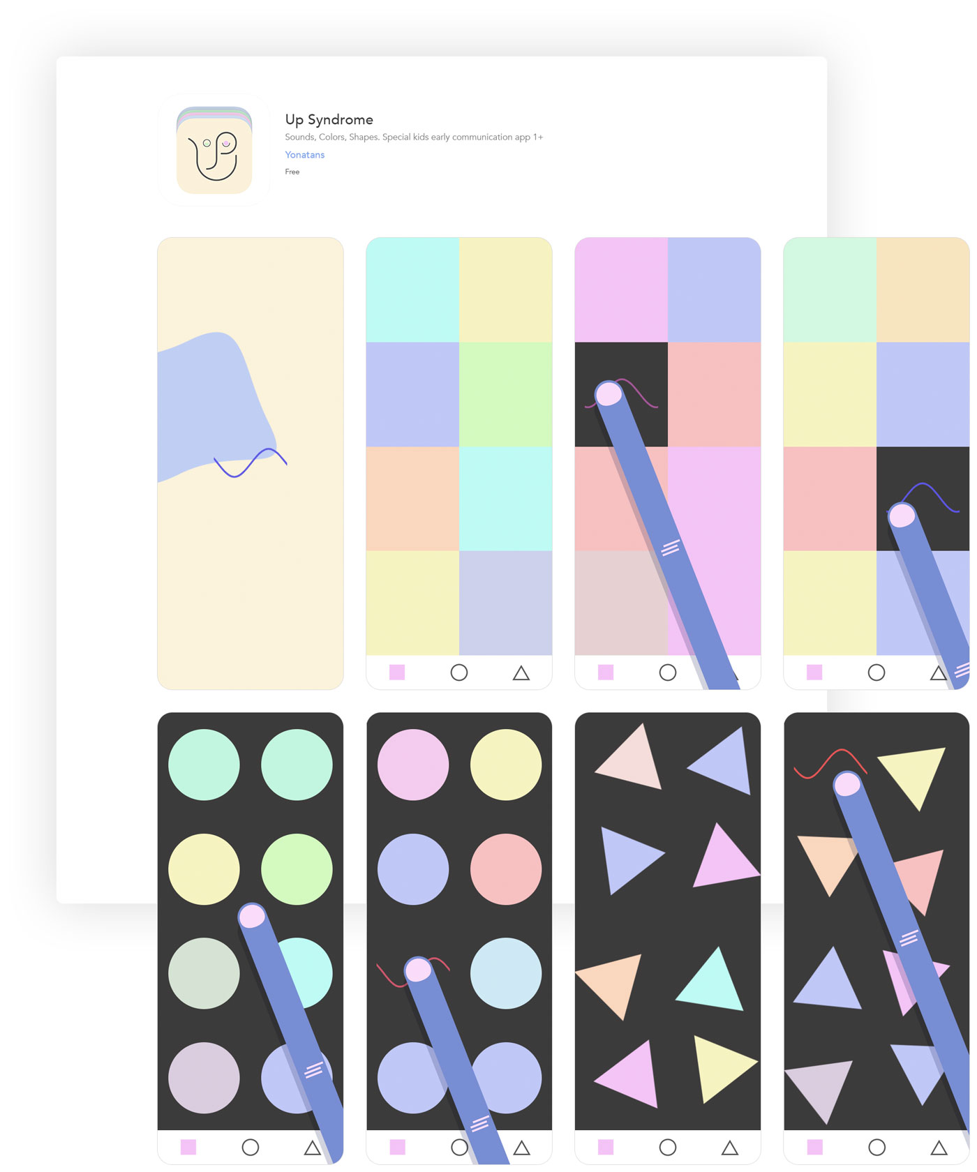
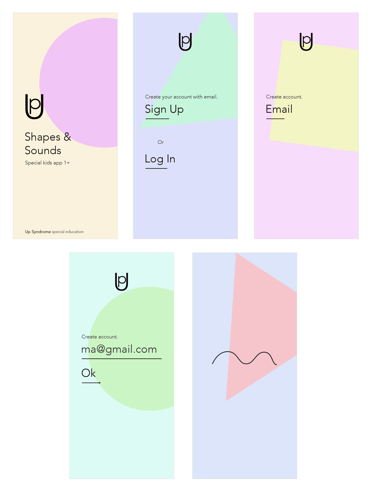
iPhone screens
The image demonstrates core screens of the app on iPhone Xup
Up Syndrome on Apps store
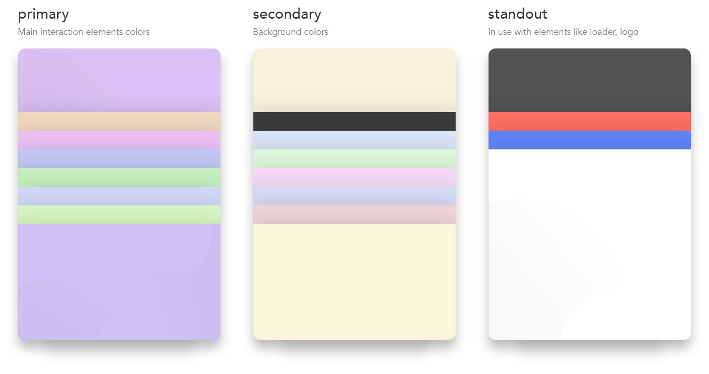
Color pallets
Primary pallet's colors used for the shapes – main elements of the app's playgrounds.
Secondary pallet's colors used for the backgrounds of the app.
Standout pallet's colors used for elements such as loader, logo, playgrounds' footer bg.
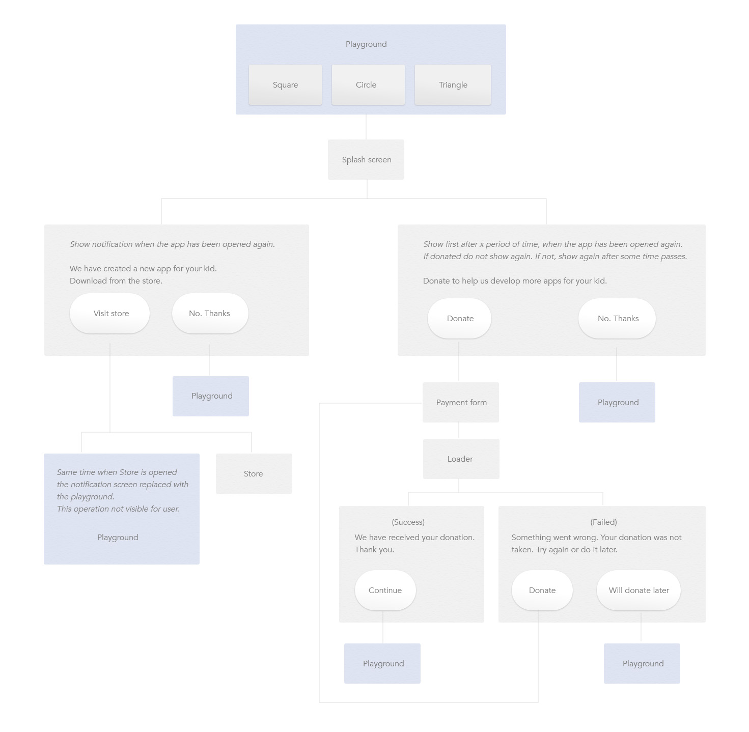
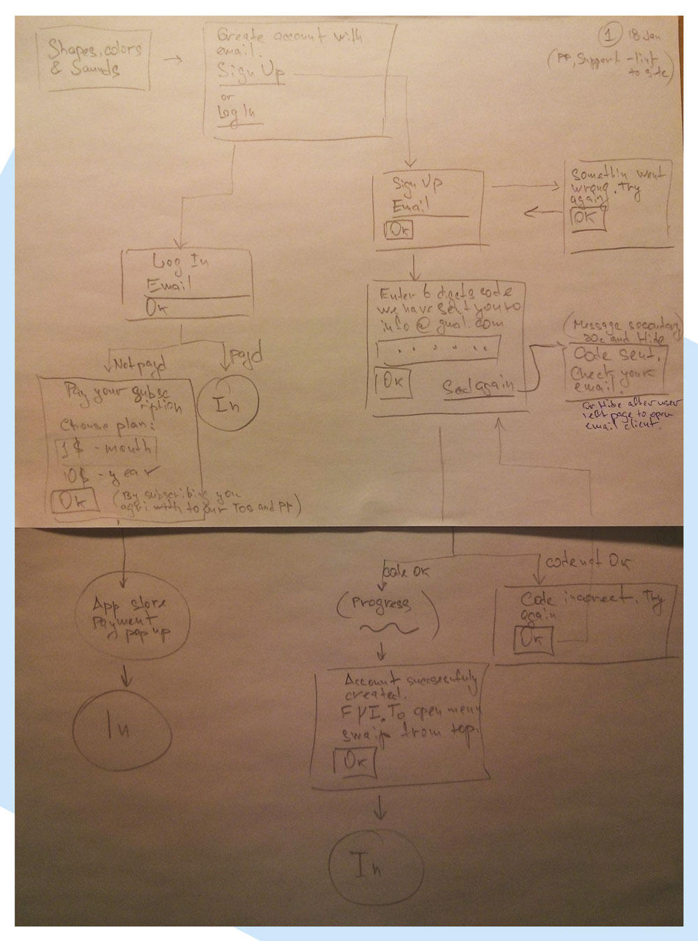
Flowchart
The schematic representation of the user' journey.
The textual content uses basic messages and wording, which will be finally formularised at the later stages of development, based on chosen style (expressions).
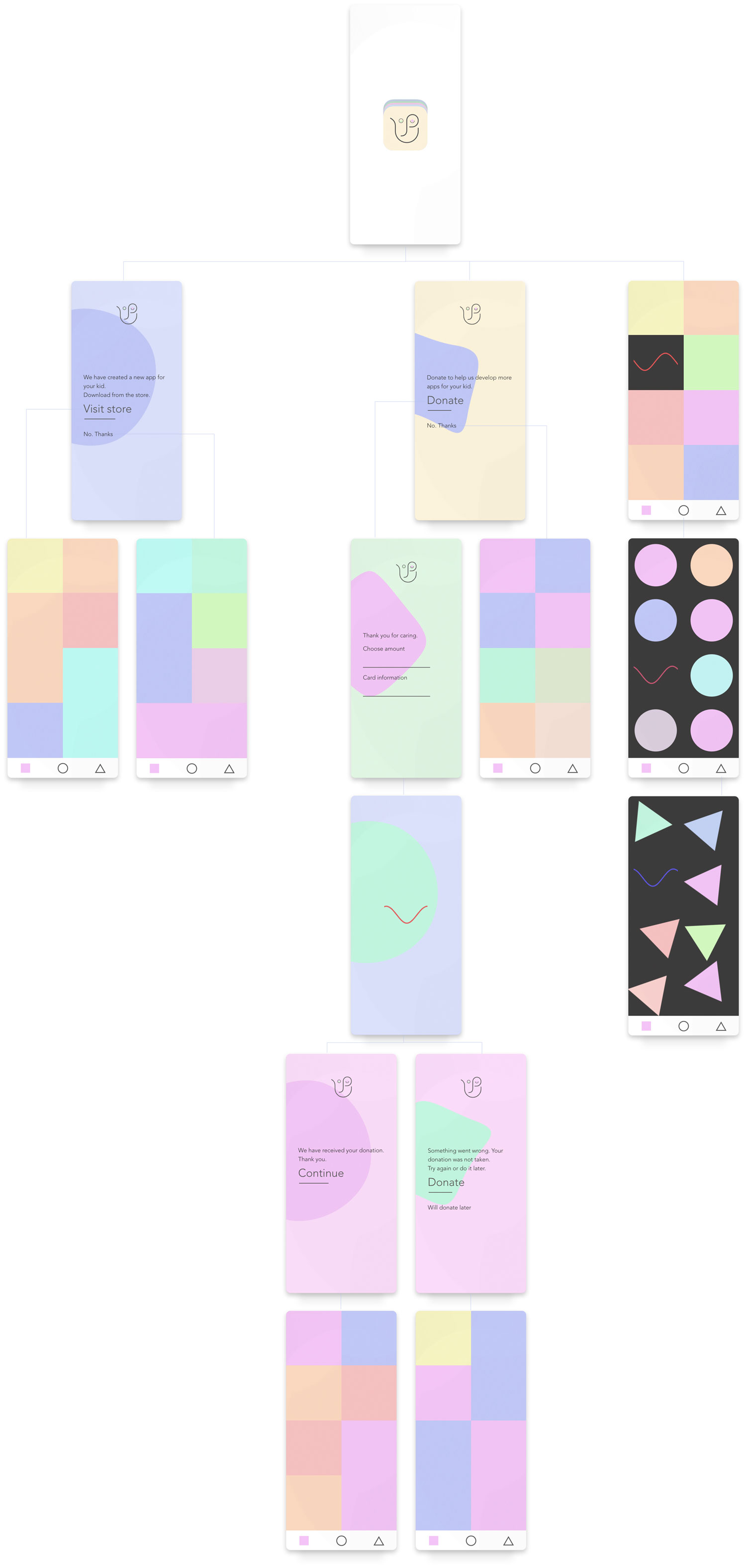
Design screens. Flow
The flow does not include external links.
First sketch and name
This first sketch of the Mobile app Formal flow includes login and Sigh up flow, as well payments, which was deprecated during the working process.
The first name of the app was MeloColorShape – melodies, colors and shapes, core components of the app.
MeloColorShape
18 Jan
First design test
Looking for the right mood - design language. Later, when I started to test the typeface on digital devises I faced a very disappointed me fact – I could not make the types look same as on image.
This was one of the reasons, but not only, to create a second version of the app.
It is hard to express how important a typography for the design, how deeply it can affect the composition.
At the really final stages of the development process the team (hmmm.. this was actually me) has decided to enlarge the functionality as well to improve the design language of the app.
We agreed to push publication of the app until new version – v2, is created.
Thank you for your time!